
MULTI-CLIENT
Logofolio
BRAND DESIGN
Distinctive
Memorable
Clean
Crisp
Bold
The greatest challenge in logo design lies in distilling a brand's core essence and values into a single, impactful symbol. This requires a deep understanding of the client's vision, target audience, and industry landscape. It's a continuous process of exploration, refinement, and ensuring the final logo not only resonates with the client but also effectively communicates the brand's message to the wider world.
Project Overview
I bring a collaborative and client-centered approach to logo design. Working closely with each client, I delve into their brand identity and target audience. Through industry research and brainstorming sessions, I develop a deep understanding of their vision. This collaborative process leads to a variety of initial sketches and logo variations, ensuring we explore all creative possibilities. With a focus on color theory and impactful design principles, I refine the chosen concept and bring it to life, resulting in a logo that perfectly embodies the brand's essence.
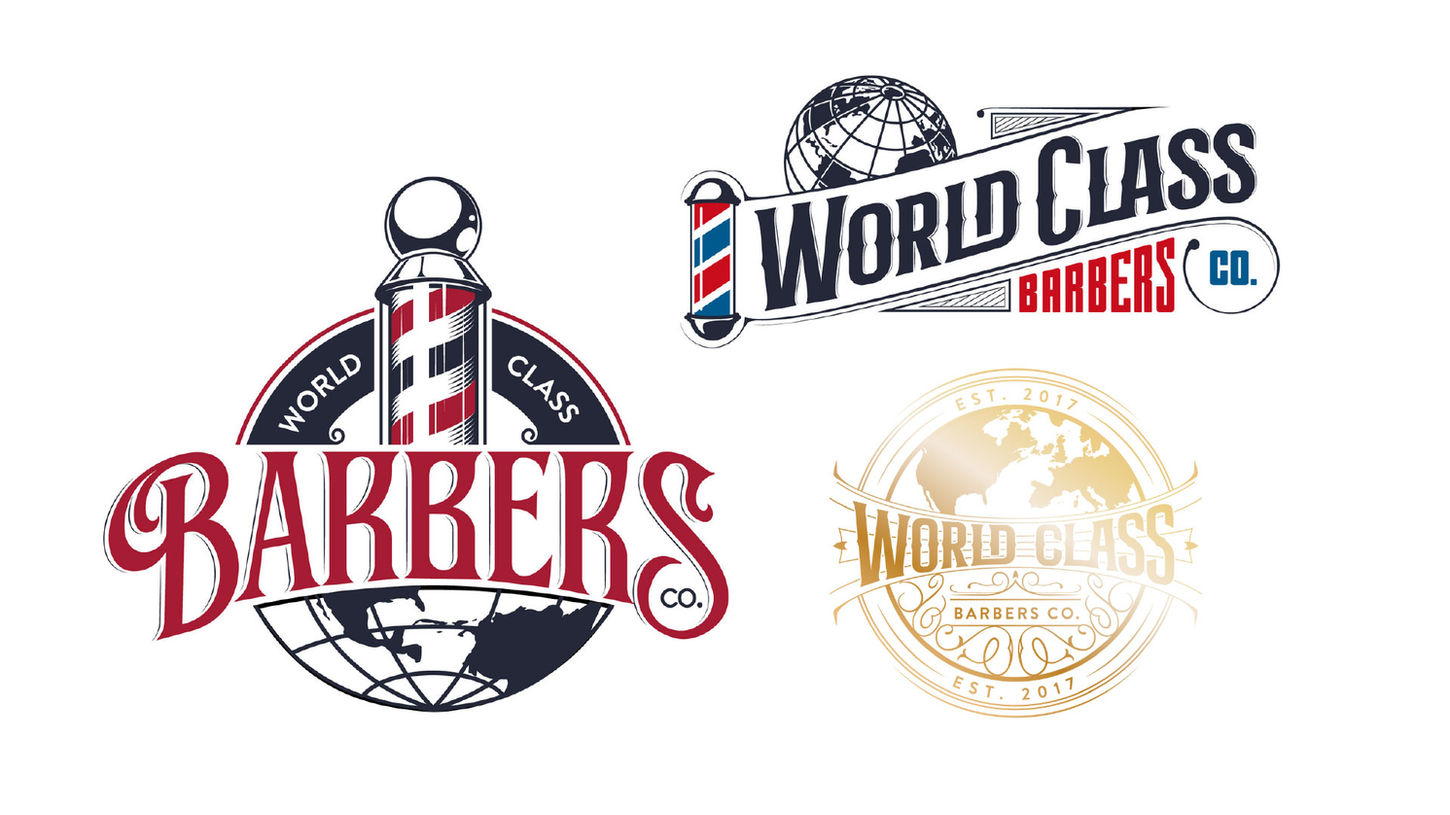
World Class Barbers
Located in Deland, FL, World Class Barbers is synonymous with pristine haircuts and any desired style, blending professionalism with a clean, inviting atmosphere. The logo seamlessly incorporates a globe while maintaining the classic red and blue barber pole, evoking a sense of upscale sophistication and timeless tradition.

Pickleball Co-Op
Pickleball Co-Op is an innovative league that encourages players to recruit and earn as they play. The logo bursts with vibrant colors and dynamic shapes, capturing the sport's excitement and energy. It's a visual celebration of community and athleticism.

Katie Collins Paintings
Katie Collins is a live wedding painter and artist based in Central Florida. Her logo features flowers blooming from her initials against a watercolor background, embodying the delicate beauty and creativity of her work. It’s an artistic blend that reflects her unique style.

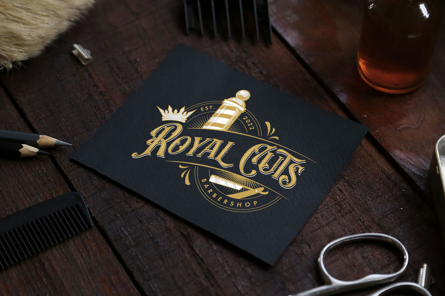
Royal Cuts
Situated in De Leon Springs, FL, Royal Cuts is a barbershop that exudes a classic and upscale feel. The logo, incorporating a crown and the traditional barber pole, reflects the regal and timeless quality of their services, offering a touch of royalty to every haircut.

Odom 8
Odom 8 is a design and construction company in Texas with a logo that exudes an upscale cowboy aesthetic. The western-style font, customized with a cowboy hat, encapsulates the rugged yet refined spirit of their work, bridging traditional Texan elements with modern design.

Makeup by Vanessa Milla
An MUA based in Orlando, Makeup by Vanessa Milla’s logo combines a gothic yet feminine feel, all hand-lettered to perfection. It’s a unique blend that reflects her bold and distinct approach to makeup artistry, appealing to those who appreciate both beauty and edge.

Sanity Technologies
Sanity Technologies provides cutting-edge tech solutions, symbolized by a logo that merges the letters S & T into a gear. Paired with a sleek, futuristic font, the design embodies innovation and efficiency, representing the company’s modern and streamlined approach.

Supreme Ski Rentals
A jet ski rental company in Central FL, Supreme Ski Rentals boasts a logo featuring two jet skis encircled by a textured palm tree. The bold "Supreme" font with a curved cut-out for "ski rentals" underneath evokes a tropical vibe, perfectly capturing the essence of fun and adventure.

Bartiatric LMS
Bariatric LMS offers a learning management system focused on bariatric surgery education. The logo, with an abstract stick figure representing the user, suggests simplicity and efficiency. Encircled by a shape symbolizing the system, the inward-pointing arrows denote progress and transformation, while the symmetry conveys balance, harmony, and strength.

Soto AAAA Inc. Flooring
Soto AAAA Inc. Flooring, a Central Florida company, caters to real estate investors and flippers with an upscale monogram of S and A. The logo’s curved flourishes nod to their old wreath logo, marrying tradition with a professional, refined aesthetic.

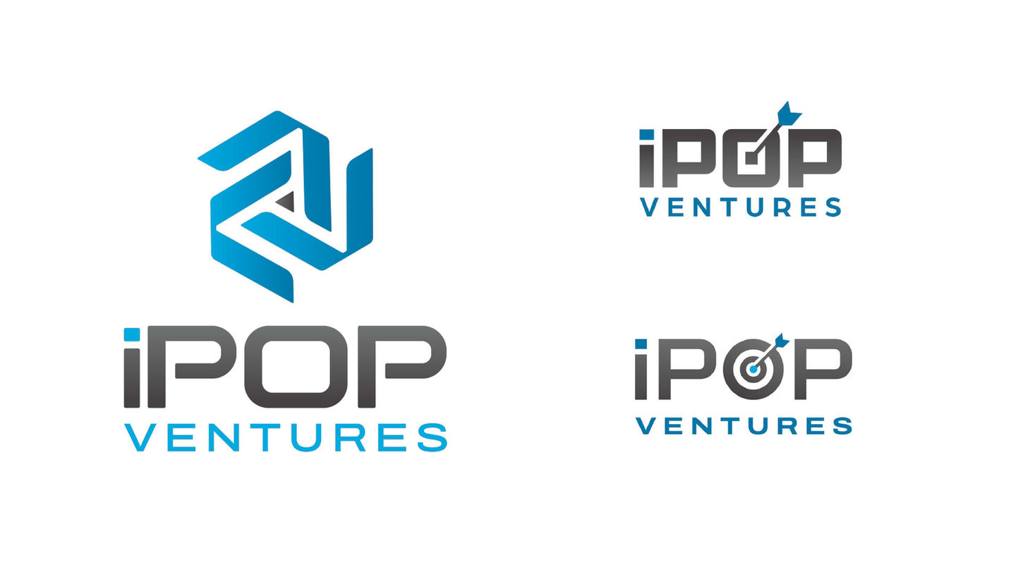
iPop Ventures
iPop Ventures, a merchant processing company, features a logo intertwining three "V" shapes that resemble triangles. This design element reflects the CEO’s affinity for triangles and the number three, symbolizing stability, direction, and balance in their services.


